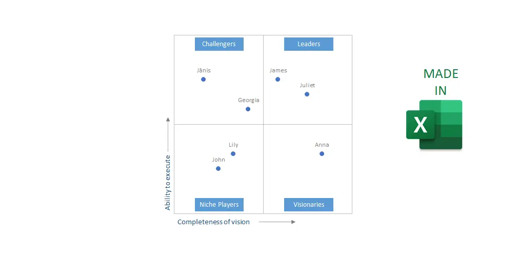
Category: Excel
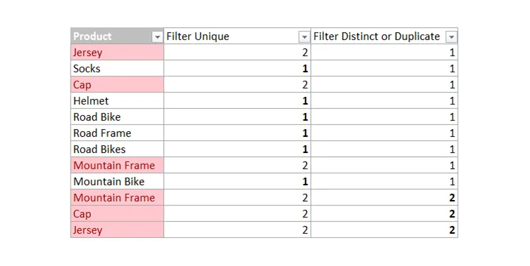
7 ways how to find or remove duplicates in Excel
Here are seven ways how to find or remove duplicates in Excel that are helpful to do other necessary actions with data. For example, filtering, deleting, or fixing duplicates. Sometimes duplicates exist if there is something missing that makes records unique.
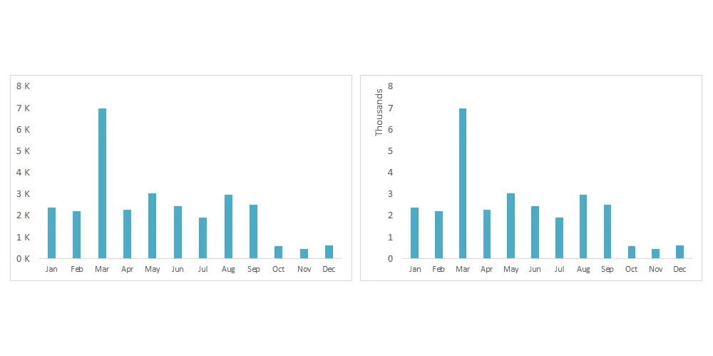
Show numbers in thousands in Excel as K in table or chart
You can show numbers in thousands in Excel as K by using format code or additional calculations. It makes it easier to read large numbers in a table or chart. In the same way, you can display numbers in millions in Excel as M. If you can use calculations, you can divide numbers by 1000…
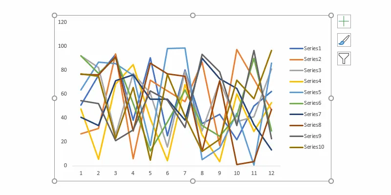
How to change weight for all series in an Excel line chart or do other formatting
If you have a line chart with a lot of series, it is time-consuming to format all of them separately. Here are a couple of approaches to quickly change the weight for all series in an Excel line chart or do another formatting. For example, change all series colors at once or change dash type.

How to move Excel chart axis labels to the bottom or top
Here is how to move Excel chart axis labels to the bottom or top of the chart. It is helpful modification if an Excel chart horizontal axis labels overlap with series. Overlapping is a typical situation if your data have positive and negative values like, for example, air temperature or other measures.
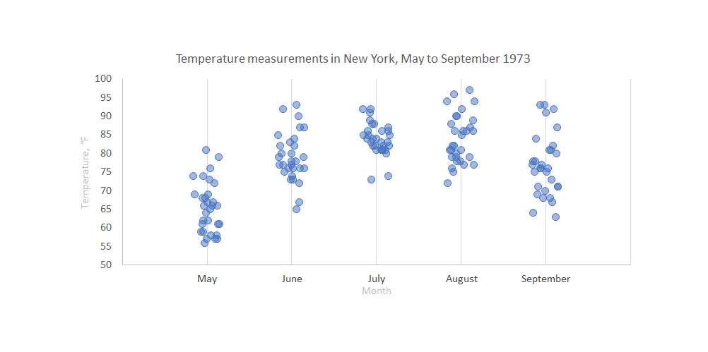
Stripchart in Excel, onedimensional scatter chart with or without jitter
Stripchart in Excel is a great way to compare data points between multiple categories. It might be with or without additional jitter. Jitter in Excel chart helps to see overlapping data points more clearly. Here is how to create one step by step.
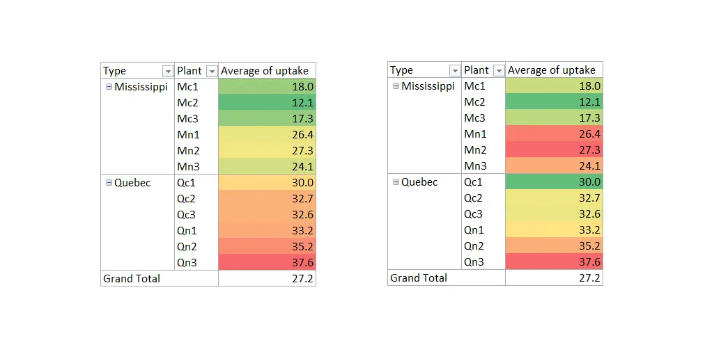
How to add conditional formatting to Excel PivotTable in 3 easy steps
It is a good idea to add conditional formatting to Excel PivotTable. PivotTable is a great tool to create flexible data summaries and conditional formatting. Flexible approach to get necessary accents. Here are 3 easy steps to add conditional formatting to Excel PivotTable and a few things to keep in mind.
Line chart with gradient color in Excel
If you have a data set with certain characteristics, you might want to take a chance and create a line chart with gradient color in Excel. Sometimes by coincidence, you can tell a better story. For example, if something is suddenly changing over time. Otherwise, color gradients are a rarely used formatting in Excel charts.