Category: DataViz
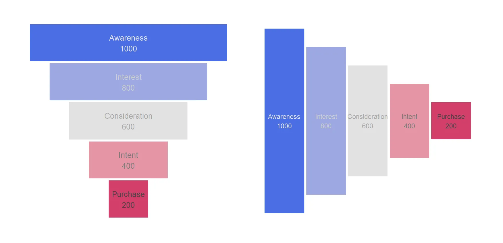
How to create a funnel chart in R using ggplot2
Here is the step-by-step process of creating a funnel chart in R with its versatile ggplot2 package. That allows us to craft visually appealing and informative funnel charts that can help you uncover insights, identify bottlenecks, and communicate the story of your data-driven processes. A funnel chart is a visualization tool that is particularly useful…
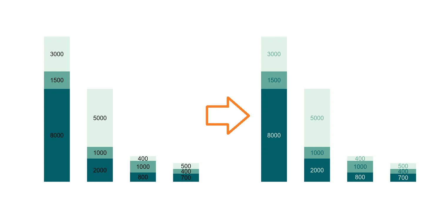
Diversify R ggplot2 stacked column chart data label colors
One of the captivating features of ggplot2 is its ability to seamlessly merge data and design, creating visually impactful charts and graphs. While a uniform color scheme for data labels in ggplot2 stacked column charts might fall short, this post unveils a technique that not only introduces sophistication to your visualizations but also amplifies data…
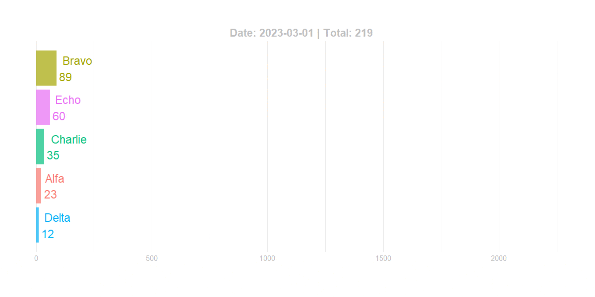
Bar chart race in R using ggplot2 and gganimate
Here is a relatively simple way to create a bar chart race in R – bar chart with bars overtaking each other. An attractive data visualization to engage your auditory while showing how the situation unfolds. Using the ggplot2 and gganimate, you can create a bar chart race in R and adjust the dynamics of…
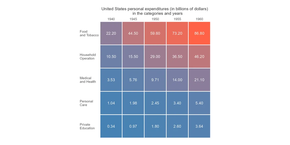
How to create a simple heatmap in R ggplot2
Here is how to quickly build a heatmap in R ggplot2 and add extra formatting by using a color gradient, data labels, reordering, or custom grid lines. There might be a problem if the data contains missing values. At the end of this post is an example of how to deal with NA values in…
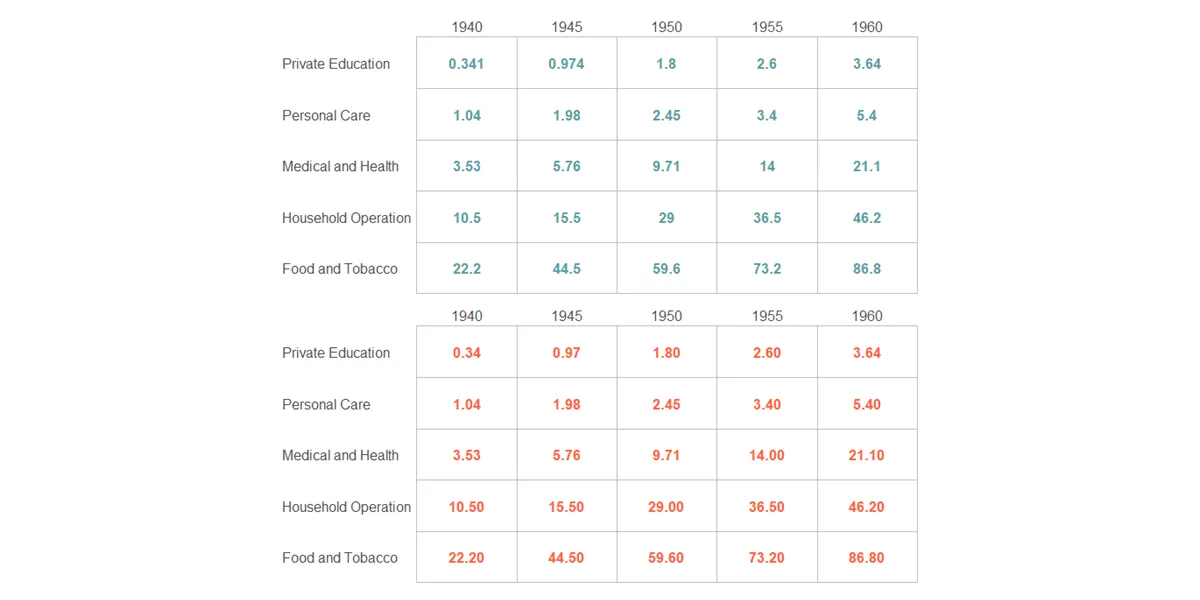
Keep trailing zeros in R ggplot2 geom_text
If you want to keep trailing zeros in R, and in particular for text labels in ggplot2 geom_text, try functions like sprintf, formatC, or digits from the formattable package. Add trailing zeros in the R data frame, ggplot2, and keep numerical properties using the function digits from the formattable.
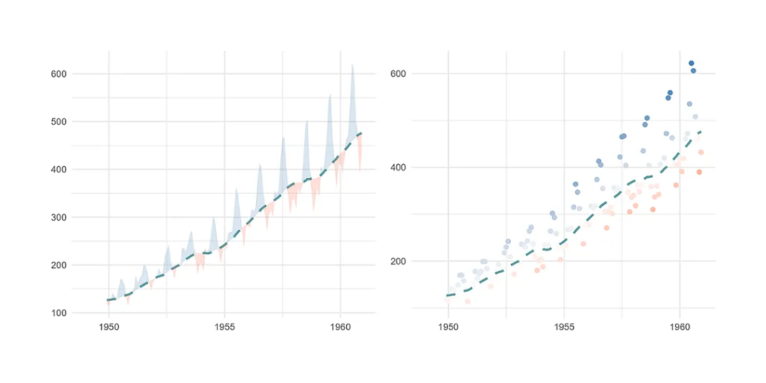
Plot moving average in R using ggplot2
Here is how to plot the moving average (rolling average or running average) in R using ggplot2 and add actual data in different ways. In that way, you can track the moving average and look at the data around that. Sometimes it helps to spot anomalies in time series.
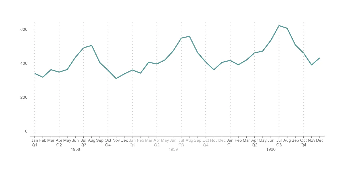
Multi-level axis labels in R plot using ggplot2
Here is an example of how to create multi-level axis labels in an R plot using ggplot2. You can separate them into 2 levels on a plot x-axis or more. It depends on the situation.
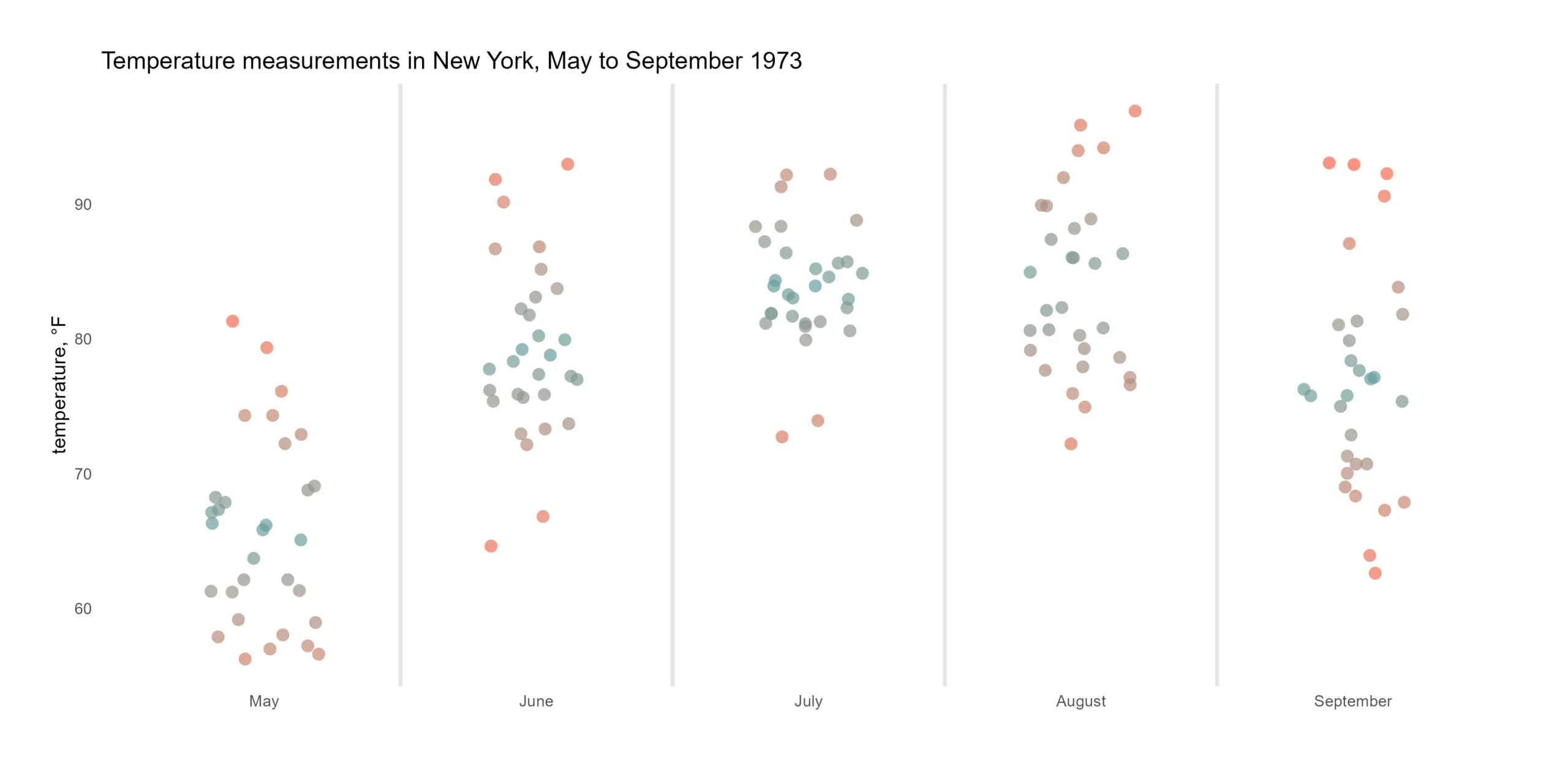
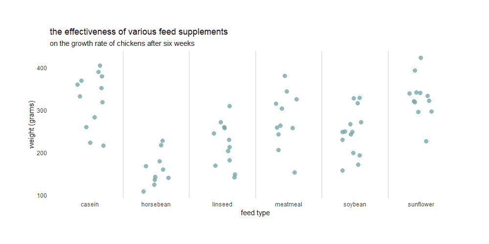
Color gradient in R jitter plot using midpoint or group
Here is how to use the color gradient in R jitter plot using midpoints or different gradients by a group. A good jitter plot in R makes it easier to view overlapping data points by categories. Color gradients might help to see differences better.
How to modify plot title in R using ggplot2
Here is how to add and modify the plot title in R using ggplot2 in many ways. After adding the ggplot2 title and subtitle, you might want to change the alignment, color, and size, add a bold effect to all or a few words, and do other customizations. Here are multiple examples of that.
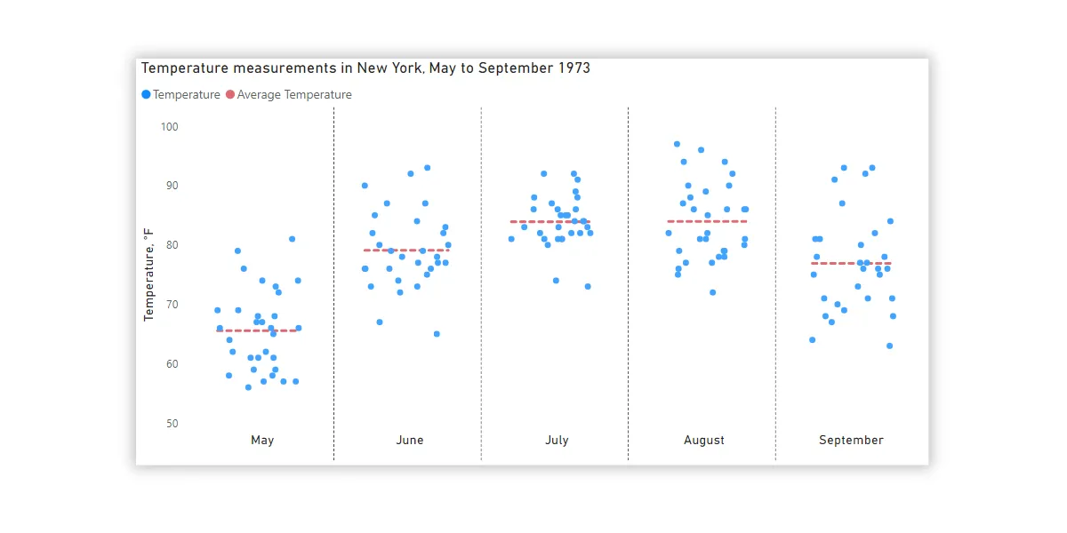
Jitter chart in Power BI with average line by categories
Here is how to create a jitter chart in Power BI with averages by categories and using only Power BI and DAX capabilities. No custom visualizations are necessary. A jitter chart makes it easier to view overlapping data points by categories.